From Data to Decisions: An Automated Football Data Pipeline
The growing influence of data analytics, machine learning, and AI in football (soccer) analytics is undeniably profound. However, state-of-the-art implementations in these fields rely on sound data foundations. Data engineering plays a crucial role here – ensuring that databases are correctly set up and automation is seamlessly integrated, enabling streamlined and high-quality data analysis.
As a football data enthusiast, I decided to construct an automated football data pipeline that initiates with data extraction through web scraping and culminates in the presentation of this data within customized dashboards in the style of the popular football management simulation game, Football Manager 2024.
TLDR (Executive Summary)
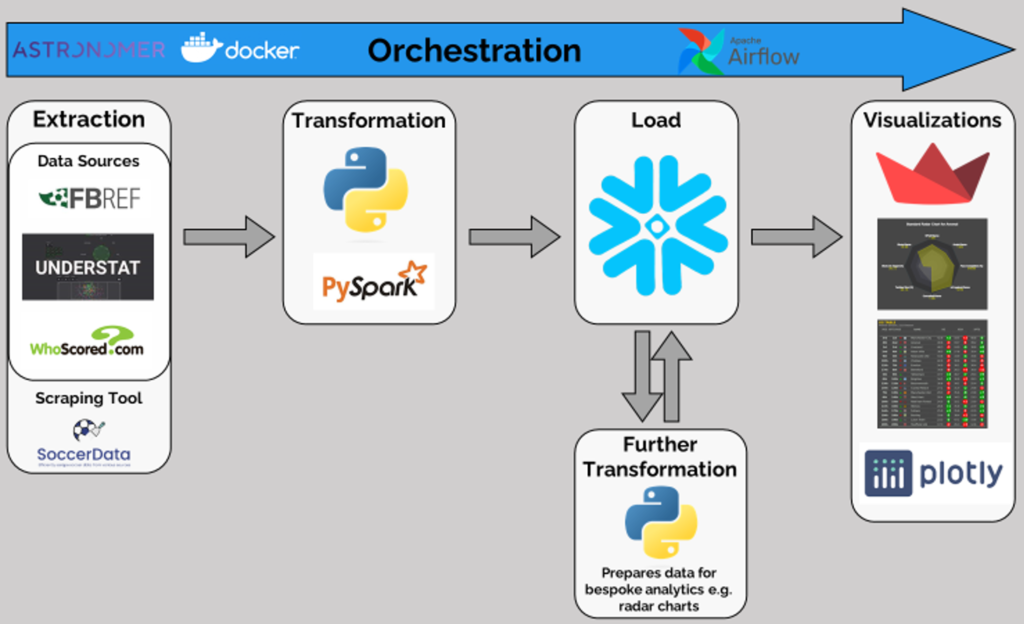
This blog provides a comprehensive overview of the process required to create and manage a data pipeline specifically tailored for football analytics. The end-to-end data ETL (Extract, Transform, Load) pipeline begins with extraction through scraping FBRef, Understat, and WhoScored using Python. Then, the data undergoes transformation via Pandas and PySpark, and is subsequently loaded into Snowflake, adhering to a pre-defined schema, which is in detail here. Further downstream, the data is again extracted from Snowflake, transformed to align with the specifications of bespoke analytic tables and charts (such as radar charts, pass maps etc.), and then loaded again into Snowflake. Finally, the data is pulled by a Streamlit application for dynamic visualization, viewable via the link: https://fm24-style.streamlit.app/. The entire process is automated, monitored, and managed using the popular orchestration tool – Apache Airflow.
The Inspiration
There are some notable accounts on X that deliver automated match reports, and must be using automated data pipelines (notably @markstats) to do so. However, there’s little information about their data engineering strategies and data sources for football. Therefore, I decided to draw inspiration from other experts in the data engineering space who are not associated with football, but have expertise in similar projects, such as Zach Wilson (below), whose post below inspired the structure of this project.
I set out to construct my own automated data pipeline for football analytics, mirroring Zach’s advice and approach. He distils the process into six methodical steps, which if you haven’t encountered in his tweet, are as follows:
- Extract– Source data, possibly via a REST API, and employ Python to retrieve it.
- Transformation- Mold the data into the required format.
- Load- Using Python, channel the data into a data warehouse like Snowflake or BigQuery.
- Further Transformations- build aggregations on top of the data in SQL using things like the GROUP BY keyword.
- Visualization- Integrate your data warehouse with tools such as Tableau to craft dynamic charts that illustrate your hard work and findings.
- Orchestration- Utilize an Astronomer account to develop an Airflow pipeline, automating the entire workflow.
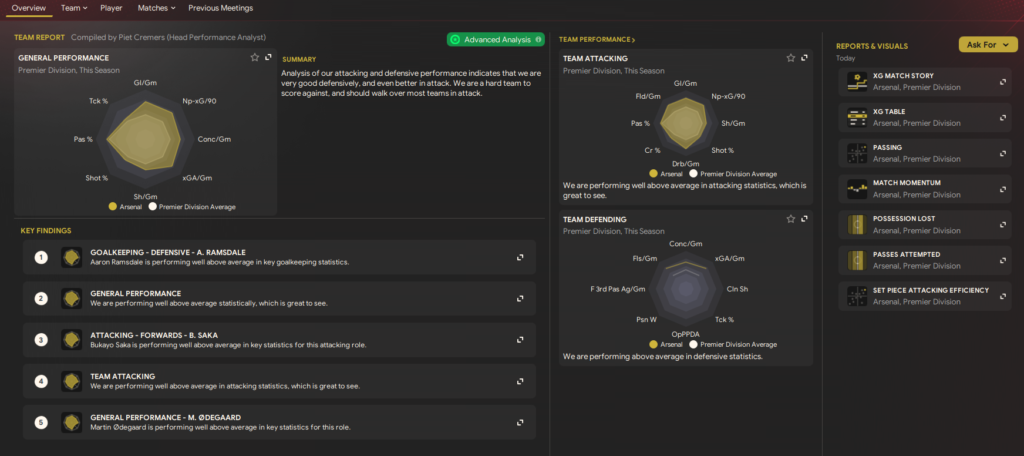
With these steps in mind, let’s dive deeper into each section, addressing the critical nuances. However, before doing so, it is important to articulate the end result of this endeavor- which is to architect a data dashboard in the style of Football Manager 2024’s Data Hub.
Extract
Navigating the world of football data acquisition presents its challenges. For example, Statsbomb, while open-sourcing alot of their data, reserves the latest and most detailed datasets from major tournaments for their paying clientele. This is a common practice among data providers, such as Opta and Wyscout, which, unfortunately, leaves hobbyists (like me) facing prohibitively high costs. Thus, to access up-to-date data, one viable route remains- web scraping.
The ethics of web scraping is a topic of debate. I assure any reader that my use of web scraping is purely as a hobbyist, devoid of any commercial gain directly from the data. With the ethical considerations addressed, let’s explore some Python-based scraping approaches:
– Custom Scraping– While creating bespoke scripts is an option, I’ve opted to use existing solutions due to their efficiency, reliability and large communities (on GitHub and discord) that allow for collaboration and contributions.
– ScraperFC– Built by Owen Seymour, and able to scrape FBRef, Understat and other websites
– Soccerdata– Built by Pieter Robberechts et al., and able to scrape FBRef, WhoScored, FotMob and other websites.
FBRef is particularly useful for detailed Team and Player statistics, whereas Understat holds more of the high level data. However, FBRef isn’t without its flaws; it sometimes omits crucial data, like Yermolyuk’s shots, which Understat’s datasets can help validate. Separately though, WhoScored contains the event data for matches, which the other sources do not provide (I shall incorporate this in future iterations of this project).
Detail on how to scrape using these packages can be found via my GitHub repo for this project, or the relevant package documentations from the link above.
Transform
Once scraped, the data is initially harnessed into pandas and PySpark data frames, and transformed to conform to a relational schema, as illustrated in the ERD below:
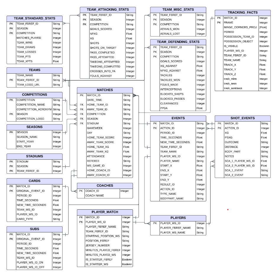
The schema generally follows a star format, where the MATCHES table acts as the fact table. Further details are:
– Normalization- There is an attempt to find the right balance between de-normalization and normalization. Given that web-scraped data can be erroneous, normalization helps in ensuring integrity and accuracy. However, tables that hold a lot of data are de-normalized to reduce expensive joins e.g. EVENTS and TRACKING FACTS that can scale to be as large as 100GB to 5 TB respectively.
– Dimension Tables- designed to decouple from data-heavy fact tables, and allow for easier modifications and operations if required e.g. the team logo can be changed quickly in the TEAMS table, and a team’s stats can be rapidly filtered without parsing event data by querying TEAM_STANDARD_STATS or TEAM_ATTACKING_STATS.
– Using Index commands– Fields commonly used for filtering and sorting are selected as primary/foreign keys and indexes, such as SEASON, HOME_TEAM_ID, and AWAY_TEAM_ID.
Almost all transformations are managed using Python, PySpark, and with some SQL included as well (90:10 approximate ratio). Finally, it should be noted that tracking data is not scraped- but rather included as an example if it was available (based on the data format provided by SkillsCorner).
Load
Post-transformation, the data is loaded into Snowflake data warehouse using the “snowflake.connector” Python package, adhering to the Schema design shown in the previous section. Whilst this can be easily replicated using another data warehouse, I have selected Snowflake due to their generous trial offering for hobbyist students.
The initial setup of the data warehouse began with a full data load, where all historical data was added to Snowflake (22/23 season and prior). This platform is particularly effective due to its columnar storage format, which makes queries faster and more efficient, especially for downstream analytics. This approach was crucial for handling and analyzing the large volumes of historical football data. Snowflake’s ability to scale resources as needed also helps maintain performance and manage costs effectively. In upcoming sections, the focus will shift to incremental updates, progressively adding new data to keep the system current and efficient without overwhelming it.
Upon loading into Snowflake, the data is not merely stored; it is enhanced via:
– Materialized Views: These constructs help join the TEAMS and MATCHES tables with EVENTS, as well as the other tables whose names end with “_STATS”. They serve as performance accelerators, precomputing complex joins and aggregations to expedite query response times.
– Clustering Keys: Deployed extensively across tables whose names end with “STATS” and “EVENTS”. These keys organize data around frequently filtered fields like TEAM_FBREF_ID, optimizing the data retrieval process.
Quality assurance is not overlooked- try/except clauses in Python scripts within Airflow act as to catch and highlight issues (explained further in the “Orchestration” section), ensuring that only data that passes our stringent quality and validation standards is admitted. This approach is critical in maintaining the integrity and reliability of our analytics.
Further Transformations
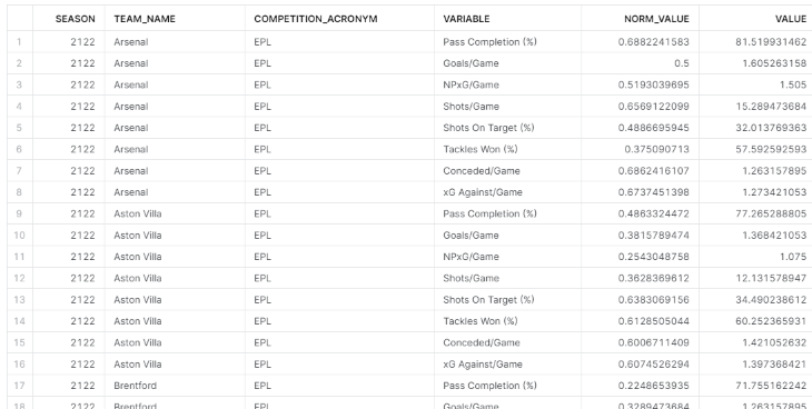
Radar charts and Pass Maps require additional data transformations for efficient display. This is detailed in Step 0 of the article accesible via this link, which shows that transforming the data involves pivoting it to create separate fields for ‘Stats’ and ‘Values’ for each unique combination of team, season, and competition. Including ‘Normalized Values’ is critical to allowing the radar chart to scale and compare data accurately.
Transforming data within Streamlit could introduce delays, impacting user interaction. To ensure quick responses, it’s beneficial to pre-transform the data for radar charts and store it in Snowflake tables, ready for use, and leverage its enhanced perforamnce for analytical operations. This approach, applied for each radar chart, optimizes the performance and enhances the user experience by providing immediate access to the visualized data..
Visualization
The sidebar on Streamlit allows the users to filter based on the Competition, Season and Team of their choice from the top 5 leagues across the last 3 seasons.
The Streamlit visualization is split into 6 tabs and their contents as shown:
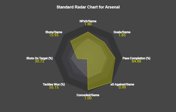
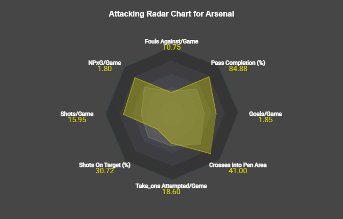
– Radar Charts- 3 Radar Charts similar to FM24’s data hub home page, which show various emtrics against the elage average.
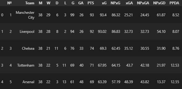
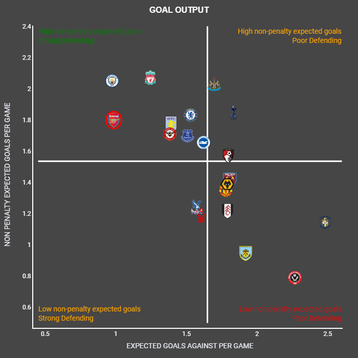
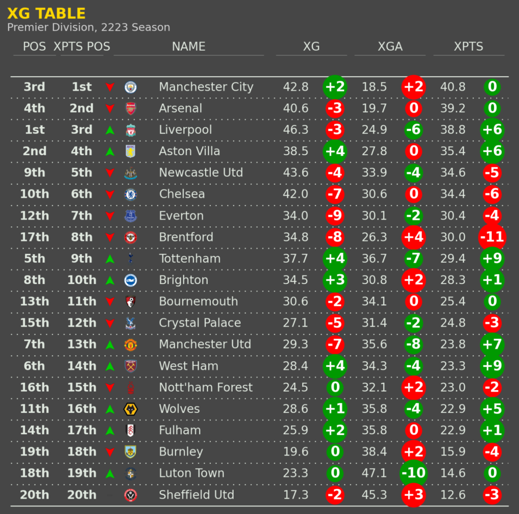
– General Charts- This contains a scatter plots to show the Goal Output and Aerial ability. Also has the “Justice Table” (xPts table).
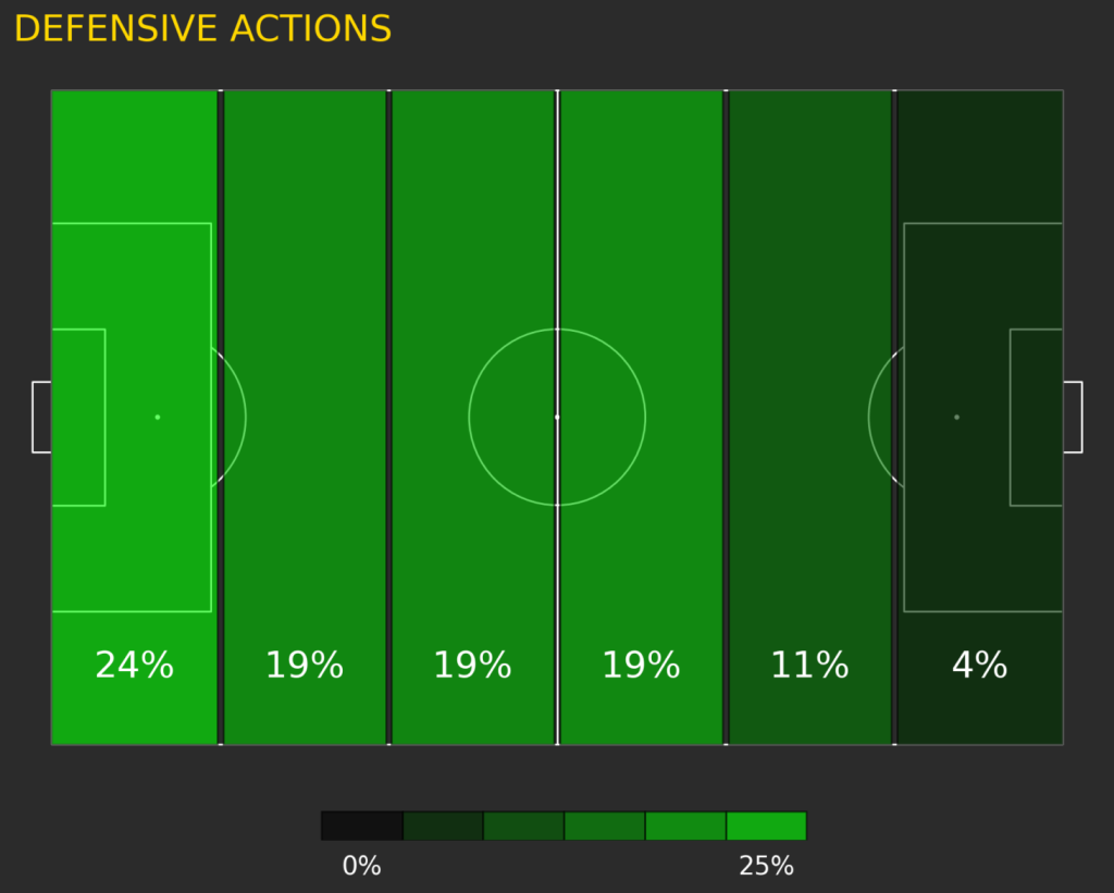
– Defending Charts– Scatter plots and pitch maps to show the team’s defending performance.
– Creating Charts- Scatter plots show the team’s crossing performance in realtion to other teams in the league.
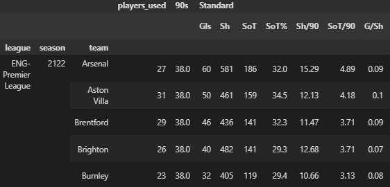
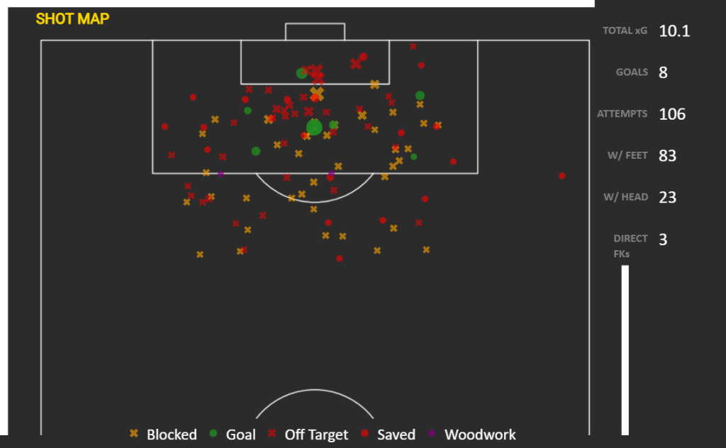
– Scoring Charts- Various charts showing the goal threat the team possesses, including an Interactive Shot Map.
– Last Match- Shows a shot map, match momentum plot and pass maps from that team’s last game.
Orchestration
With the data securely sotedin Snowflake, Airflow takes center stage, automating the update process post each gameweek. Following the guidance of Zach Wilson, the process leverages Astronomer, which uses Docker to containerize and run Airflow with the necessary python packages.
The workflow is structured as a DAG, as illustrated below. This DAG orchestrates a sequence of tasks starting with the scraping of new data, performing the necessary transformations, loading the updated figures into Snowflake, and carrying out the subsequent transformations needed for the radar charts. The final step is the uploading of this refined data into designated tables for visualization.
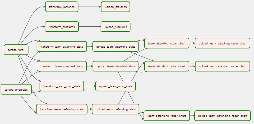
Additionally, error handling is an integral part of this orchestration, with Airflow managing error logging, monitoring for alerts, and implementing retry mechanisms to handle failures gracefully. This comprehensive approach ensures that data integrity and availability are maintained, providing a reliable foundation for up-to-date analytics.
Summary, Reflection & Future Direction
In conclusion, it’s beneficial to reflect on some of the challenges overcome in this project. The journey began with addressing data quality during the web scraping phase and continued through to the pivotal transformation process that structured the data for analysis. Utilizing Snowflake’s columnar storage and scalability features was essential, culminating in an interactive visualization platform. Finally, orchestrating these components with Airflow, ensured that each new gameweek’s data is automatically prepared, loaded and visualized.
This project has been an immensely rewarding step in a larger journey. The hands-on experience has not only honed my data engineering capabilities but also heightened my understanding of data’s crucial role in driving meaningful analysis in football.
The future of this pipeline holds exciting possibilities. I plan to add visualziations on the player-level just like in FM24, and text-based analysis with open-source LLMs. In the meantime, I invite you to peruse the code, offer constructive feedback, and suggest enhancements. The complete codebase is available on my GitHub repo, and I also encourage you to connect with me on LinkedIn for any discussions or collaborations.
The role of analytics in transforming our appreciation of football is ever-growing, and I’m eager to contribute to this evolution. Thank you for accompanying me on this venture. Together, let’s continue to explore and expand the horizons of football data analytics.